A portfolio site that proves the craft before the pitch.
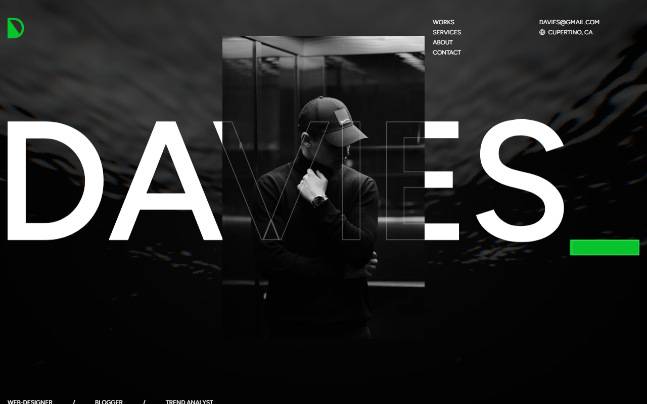
Dark, editorial, motion-heavy. Character-level scroll reveals, pinned horizontal service panels, a WebGL hero — delivered as clean static HTML that loads fast, indexes properly, and runs on any host without a CMS bill.
// the brief
Your portfolio has about four seconds.
You already know your work is good. That's not the problem. The problem is that the person deciding whether to hire you is looking at your site on a phone, between meetings, with two other tabs open on two other people who do roughly what you do. They'll form an opinion before they read a single case study. Then they'll either scroll — or close the tab.
Everything we do on a portfolio build is aimed at that four-second window, and at the ninety seconds after it. Make me look like the best person in my field, and don't make it slow. That was the brief.
// the motion system
Motion that guides. Not motion that decorates.
Scroll animation has a bad reputation, and it's earned. Most of it is decoration: things sliding in from the left because a plugin was installed. We use it as a pacing tool — motion controls the order in which a visitor absorbs information.
Character-Level Scroll Reveals
Headlines are split into individual characters. Each one lifts from dim grey to full white in sequence, tied directly to scroll position — not on a timer. Scroll slowly and it fills slowly. Scroll back up and it un-writes. The visitor is physically in control of the reveal, which means they actually read the line instead of skimming it.
Pinned Horizontal Service Scroll
When you reach the services section, the page holds still and services move sideways. It turns a list into a sequence, so each offering gets its own moment instead of competing with the next one in a vertical stack. On mobile it dismantles itself completely and becomes a normal scroll — because a pinned horizontal section on a phone is a trap, not a feature.
WebGL + Momentum Scroll
One homepage variant runs a real-time WebGL background via Unicorn Studio that reacts as you move. Both variants run momentum scrolling with weight and easing rather than snapping line by line — the single change most people can feel but can't name. A cursor trail draws a gradient line behind the pointer and ripples on click.
Critical detail: every animation is held back until the page finishes loading. A preloader gates everything — only when it clears do animations begin measuring the layout. That's why nothing jumps, stutters, or fires at the wrong scroll position, which is the failure mode of roughly every animated template you've clicked through and closed.
// design tokens
One line changes the entire colour scheme.
Brand colours change. Clients rebrand, sub-brands launch, a campaign needs its own palette for six weeks. So we don't hard-code colour. Every colour in the build resolves through a single token layer.
This site ships with eight complete palettes — green, amber, orange, cyan, lime, violet, red, pink — each defined once and applied everywhere. Switching the site's entire identity is one attribute change on the body element, not a find-and-replace across 150 KB of stylesheet.
Self-hosted, editable icons.
A custom Icomoon icon font rather than a third-party CDN. Editable in the Icomoon app, so a client's icons can be added to the set later — and it doesn't depend on someone else's CDN staying online in 2029.
// page architecture
Everything a creative business needs — in one scroll.
Homepage section order
What ships alongside
2 Homepage Layouts
Version 1 runs GSAP + WebGL. Version 2 uses a video hero and adds a Feature breakdown and Process walkthrough — genuinely different structures, not one recoloured twice.
4-Template Blog System
Single-column with sidebar, two-column grid, three-column grid, and a full article page with comments, search, and related posts.
Styled 404 Page
Because the error page is a page your visitors will see, and a default server error is the one moment a site tells the truth about how much care went into it.
// performance & accessibility
The unglamorous work that decides whether it performs.
This is the part most people never see, and it's most of the value. A site can look incredible in a Figma file and still fail every real-world measure that matters.
// the architecture decision
No framework. That's deliberate, not a shortcut.
For a portfolio site, HTML, CSS and JavaScript is not a limitation. It's the correct architecture, and it matters to the budget and longevity of the project.
Runs anywhere
Netlify, Vercel, S3, or £4/month shared hosting. No build server, no serverless functions, no platform subscription that scales with traffic.
Doesn't decay
A framework build needs its dependencies updated or it becomes unbuildable in about eighteen months. Static HTML from 2015 still works. Come back in three years wanting a new case study — the site opens and edits.
Faster by default
No hydration, no client-side routing, no JavaScript bundle to parse before anything appears. The browser gets HTML and renders HTML. Search engines see everything in the initial response.
26 SCSS partials. One compile command.
Styling is written across 26 organised partials — variables, mixins, reset, typography, then one file per component: buttons, forms, accordions, carousels, testimonials, header, footer. It compiles with a single command and no toolchain. Structured like a system, delivered as a static file.
// built with
The stack.
Structure & Styling
Motion & Interaction
Advanced Effects
Performance & SEO
// want a site like this?
A portfolio site is a sales asset that works while you're asleep.
Motion that guides instead of decorating. Colour that's one line to change. Static delivery that stays fast and stays alive. Tell us what you do and who you're trying to reach.
Built by Presencify · presencify.digital