
A 13-page AI agency site. Custom brand. Live in days.
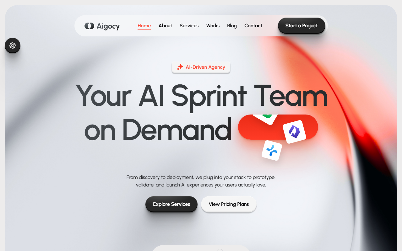
AI agencies sell something buyers can't see. This site makes the invisible legible — a complete marketing presence with live theming, scroll-driven animation, and a content architecture built around how AI buyers actually make decisions.
// the brief
AI agencies have a positioning problem.
A design studio shows you a portfolio. A construction firm shows you a building. An AI consultancy shows you a slide about retrieval-augmented generation. The result is that most AI agency websites collapse into the same page: a gradient hero, three capability cards, a logo wall, and a contact form. Every competitor claims to do agents, evals, and custom models. Nothing differentiates.
The client had a real, specific methodology — a discovery-to-evaluation pipeline they run on every engagement — and a site that communicated none of it. The site needed to do three jobs at once: explain complex technical services to non-technical buyers, prove credibility to technical evaluators, and convert both into booked calls.
// the approach
Build from scratch, or build on a foundation?
A marketing site is a solved problem. The shape is known: hero, social proof, services, process, proof of work, pricing, FAQs, contact. Rebuilding that structure from an empty file isn't craftsmanship — it's billable hours. What differentiates a site is everything downstream: the positioning, the content architecture, the brand system, the performance, the conversion path. That's where engineering effort creates value.
So we don't start from zero. We start from a professionally engineered foundation, then rebuild everything that carries the brand. The catch is that most templates are terrible to build on — hardcoded colors, monolithic stylesheets, vendor code tangled with custom code. So we audit before we commit.
Token-driven styling
The entire colour system lives in CSS custom properties — a full neutral ramp plus a single --brand variable. When the client's brand colour changes, one line changes. Not a find-and-replace across 10,000 lines of stylesheet.
Modular SCSS architecture
~10,300 lines in a 7-1 structure with 13 separate element partials for buttons, forms, carousels, testimonials, and more. New pages and components slot in without cascade failures.
Clean code separation
~950 lines of custom JavaScript sit apart from vendor libraries. When a library needs a security update, the custom behaviour doesn't break. This is the thing that makes a site cheap to maintain two years post-launch.
15 namespaced sections
Every homepage section is independently namespaced. We can reorder, remove, or duplicate any of them without side effects — which let us restructure the entire page flow around the buyer journey.
// what was built
Four workstreams. One launch.
Brand Integration
The client's palette mapped onto the CSS token layer — not painted over the top. Typography, logo system, favicon, and icon set replaced across all 13 pages. The site ships with eight switchable brand presets, each overriding a single variable, with the visitor's choice persisted to localStorage. Marketing can test a new accent without a support ticket.
Content Architecture
Every section rewritten for the client's actual service lines. The homepage sequence — hero, social proof, services, benefits, process, featured work, outcome stats, team, testimonials, tooling, pricing, FAQs, contact — ordered to mirror how their buyers make decisions: what is it → can I trust you → how does it work → what does it cost → how do I start.
Motion with a job to do
GSAP ScrollTrigger driving character-level text reveals, staggered fade-ups, and flip-image transitions — tuned so motion supports the reading order instead of competing with it. Profiled on mid-range Android so it doesn't stutter for the majority of traffic that isn't on a flagship phone.
Technical Customisation
Contact forms on 7 pages wired to a real handler with validation and spam protection. Monthly/yearly pricing toggle against real price points. 87-file, 24 MB image library compressed and moved to responsive delivery. Page titles, meta descriptions, Open Graph tags, and schema markup rebuilt — the base template shipped with a stale meta description inherited from a different product entirely.
// page inventory
13 pages. Every surface accounted for.
Homepage section order
Full page list
2 Homepage Variants
Home Gradient and Home Animated — same 15 sections, different hero treatment and animation styling.
4 Blog Layouts
Standard list, two-column grid, three-column grid, and a full article page with sidebar, search widget, and CTA form.
Service + Work pages
Service overview, service detail template, portfolio grid, and case study template — enough to showcase any engagement type.
About, Contact, 404
Agency story, team, and stats. Contact with form and map. A fully styled error page, because visitors see it.
// performance & QA
The work that decides whether it converts.
None of this is exciting. All of it is the difference between a site that looks good and a site that books calls.
// honest assessment
When this approach is right — and when it isn't.
Most agencies leave this part out. We won't.
Right fit ✓
Wrong call ✗
For those, we build from scratch — and we'll tell you so on the first call, not three weeks in.
// built with
The stack.
Structure & Styling
Motion & Interaction
Custom Behaviours
Performance & SEO
// production-ready in days
A full marketing site. Fixed timeline. Fixed price.
We'll audit what you have, tell you honestly whether you need a custom build or a fast foundation-based launch, and give you a fixed timeline and price either way.
Built by Presencify · presencify.digital